這種情景怎么解釋?display:flex 遭遇 white-space: nowrap;
問題描述
html如下,使用了flex-box布局,左邊圖片的img-box定寬,右邊的css定義了flex-item,然后對shop-name進行了單行不換行截斷,這時候就發現左邊的圖片被擠扁了,小于定的寬度。發生這個情況在chrome上,ios和安卓的微信下正常.
chrome效果見圖:
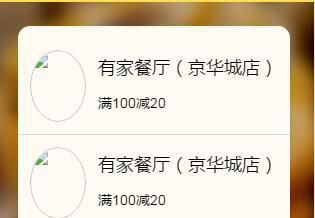
<a href="#" class="coupons-item flex"> <div class="img-box"><img src="1.jpg" /></div> <div class="flex-item"><h3 class="shop-name">有家餐廳(京華城店)</h3><div class="text">滿100減20</div> </div></a>
(scss)
.coupons-item{ padding:1rem; color:#000; text-decoration: none; border-bottom:1px solid $gray-border-color; .img-box{ width:6rem; height:6rem; margin-right:1rem; @include radius(50%); overflow: hidden; img{ display: block; width:100%; height:100%; @include radius(50%); } } .shop-name{ line-height:2; height:3.6rem; font-weight:normal; font-size:1.8rem; overflow: hidden; -ms-text-overflow: ellipsis; text-overflow: ellipsis; white-space: nowrap; } .text{ font-size:1.4rem; }}
問題解答
回答1:之前遇到過,解決辦法:首先.flex-item設置下最小寬度
min-width:0
然后.shopname設置下寬度
width:100%
相關文章:
1. docker 17.03 怎么配置 registry mirror ?2. javascript - sublime快鍵鍵問題3. javascript - immutable配合react提升性能?4. 實現bing搜索工具urlAPI提交5. javascript - vue-router 地址改變數據未改變6. javascript - html5多個label中其中一個觸發change,如何判斷是哪一個出發了change7. css - 移動端字體設置問題8. phpstudy8.1支持win11系統嗎?9. css - 寫頁面遇到個布局問題,求大佬們幫解答,在線等,急!~10. 配置Apache時,添加對PHP的支持時語法錯誤

 網公網安備
網公網安備