css3 - css做動畫效果
問題描述
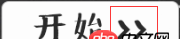
把紅色框內(nèi)做成那種來回動畫效果怎么做啊?
問題解答
回答1:<!DOCTYPE html><html><head><style> p{ width:100px; height:100px; background:red; position:relative; animation:mymove 1s infinite; -moz-animation:mymove 1s infinite; /* Firefox */ -webkit-animation:mymove 1s infinite; /* Safari and Chrome */ -o-animation:mymove 1s infinite; /* Opera */ animation-direction: alternate;}@keyframes mymove{ from {left:0px;} to {left:200px;}}@-moz-keyframes mymove /* Firefox */{ from {left:0px;} to {left:200px;}}@-webkit-keyframes mymove /* Safari and Chrome */{ from {left:0px;} to {left:200px;}}@-o-keyframes mymove /* Opera */{ from {left:0px;} to {left:200px;}}</style></head><body><p></p></body></html>
運行一下上面的代碼,改于w3school。
鏈接為:http://www.w3school.com.cn/cs...
回答2:給你個鏈接 自己對著改參數(shù)
回答3:給那個三角圖片 擺好位置后, 用類去控制動作。
比如
.move { -webkit-animation-name:’example’; // other code} @-webkit-keyframes ’example’ { 0% {-webkit-transform: translateX(0); } 50% { -webkit-transform: translateX(100px); } 100% { -webkit-transform: translateX(0); } } // 補充說明: -webkit-animation-name:’xxx’;/*動畫屬性名,也就是我們前面keyframes定義的動畫名*/ -webkit-animation-duration: 10s;/*動畫持續(xù)時間*/ -webkit-animation-timing-function: ease-in-out; /*動畫頻率,和transition-timing-function是一樣的*/ -webkit-animation-delay: 2s;/*動畫延遲時間*/ -webkit-animation-iteration-count: 10;/*定義循環(huán)資料,infinite為無限次*/ -webkit-animation-direction: alternate;/*定義動畫方式* 回答4:
css3的動畫效果主要是通過過渡來實現(xiàn)的,用animate來定義一個補間動畫,瀏覽器會自動根據(jù)設(shè)置的時間來進(jìn)行渲染。樓上兩位大神的代碼已經(jīng)做得很完善了,具體效果題主可以自己根據(jù)需要修改
相關(guān)文章:
1. javascript - sublime快鍵鍵問題2. javascript - immutable配合react提升性能?3. css - 寫頁面遇到個布局問題,求大佬們幫解答,在線等,急!~4. javascript - nodejs關(guān)于進(jìn)程間發(fā)送句柄的一點疑問5. Apache 已經(jīng)把網(wǎng)站根目錄的改為allow from all了,但是服務(wù)器還是不能訪問?6. 實現(xiàn)bing搜索工具urlAPI提交7. 配置Apache時,添加對PHP的支持時語法錯誤8. vue.js - Vue 如何像Angular.js watch 一樣監(jiān)聽數(shù)據(jù)變化9. javascript - 移動端上不能實現(xiàn)拖拽布局嗎?10. phpstudy8.1支持win11系統(tǒng)嗎?

 網(wǎng)公網(wǎng)安備